


Guide to Creating a Performing Website Header Design

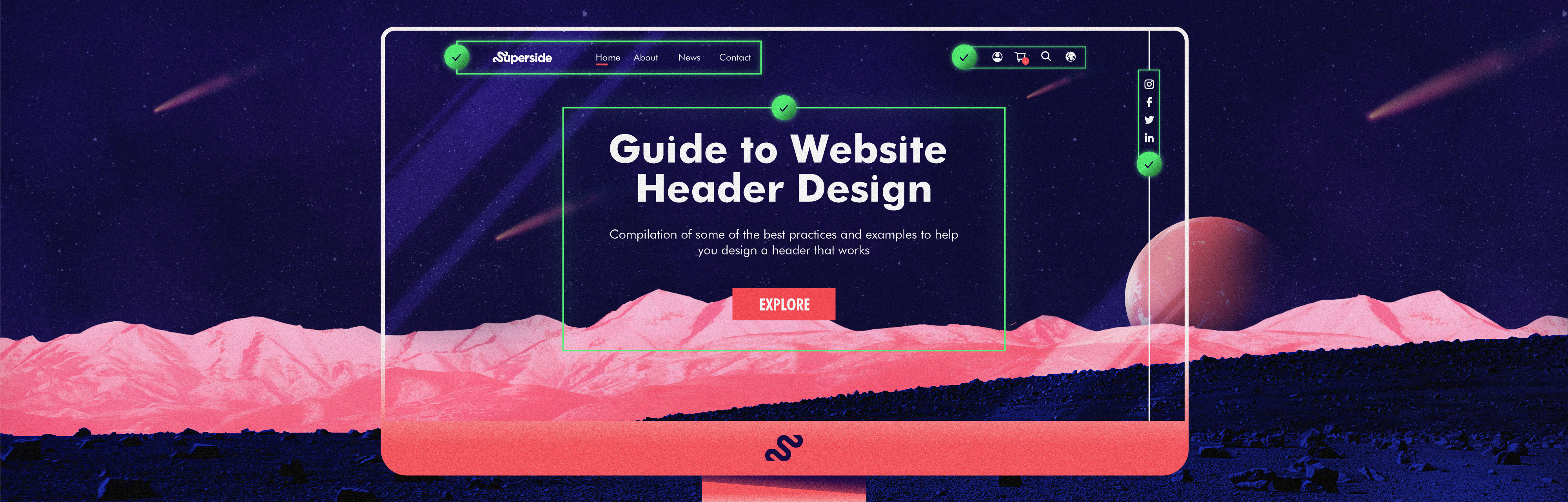
You don’t get a second chance at a first impression, and the same goes for your company’s website header design. Research shows that 55% of website visitors only stay about 15 seconds on a website before leaving. Considering that your website header is the first section of your webpage that visitors will see, it needs to pack a punch.
Your website header should reflect your brand, clearly communicate what you offer, and be eye-catching enough to grab your audience’s attention and convince them to keep scrolling. It should also check all of these boxes in as little time, and with as little copy, as possible. Depending on the page you’re designing a header for, you really need to tailor the creative, messaging and CTA.
“I think your hero image is ten times more important than the copy,” says Bill Macaitis, the former Chief Marketing Officer at Slack. “Can you explain what you do via a visual versus writing it out? Your ads and website should be able to pass the five-second test: someone should know exactly what you do after seeing your offer for just five seconds.”
So, where do you start? Fortunately for you, we’ve compiled some best practices and examples to help you design a website header that works.
What is a Website Header?
A website header, also called the ‘above the fold’ section, is the part of your website shown at the very top of a page.
Website headers have three primary functions:
- Information. It should let your visitor know what your brand does.
- Navigation. It should help direct your visitors to other pages.
- Visual appeal. It should be interesting and attractive enough to grab your visitor’s attention.
Like a store entryway, your header should set the tone for your website and give your visitors a feel for your brand.
Website header designs usually have all, or most, of the following elements:
- Business name
- Logo or brand identifier
- Call to action
- Text or headline
- Navigational elements
- Search
- Shopping cart
- Log in
- Social media links
- Languages
Why a Header Hero Image Matters in Website Design
If the website header is an entryway, then your hero image is kind of like the signage out front. This large banner-like image gives website visitors a taste of what you offer and provides that all-important visual appeal that can help people stay on your website. One study found that roughly 80% of website visitors focus most of their attention above the fold.
Whether you opt for a picture, graphic, video, or animation, your hero image should directly convey key information about the business. For example, a food delivery service might opt for a hero image that depicts a courier with a mouthwatering container of food. A fitness tracking app might use a quick animation of its interface and features. There’s lots of room for creativity when designing a hero image, but the visual’s main purpose should be to encourage visitors to learn more about your business.
Using stock photos for your hero images is a surefire way for your brand to get lost in a sea of competition. To stand out, get our ContentOps guide to learn how people, processes and tools can get help you get more ROI (and reduce chaos) from your content.
How to Create a Website Header Design that Performs
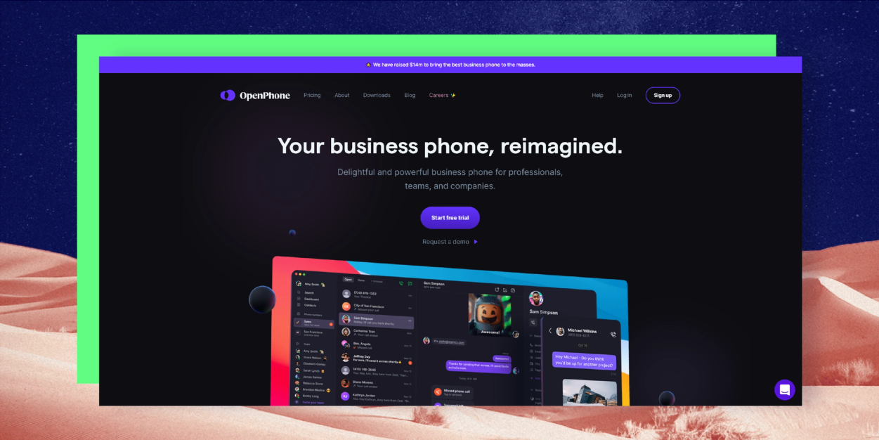
1. Keep your overall purpose in mind
What’s the first step that you’d want your visitor to take after landing on your website? Where would you like them to go? What information do they need to access quickly? Before you start your website header design, you should have a solid understanding of what you’d like to achieve with your website as a whole and how your header fits into the mix.
For example, OpenPhone’s website header includes a snapshot of the app’s interface to give visitors an idea of what it looks like, and its “Start Free Trial” CTA invites users to get started with the service right away.
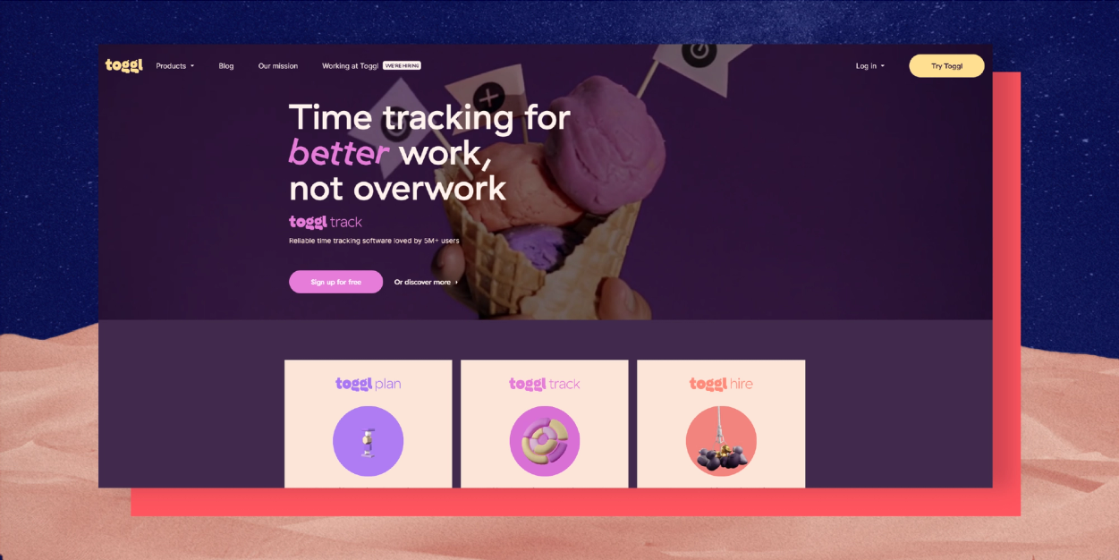
2. Include a clear call to action
In the wise words of Brené Brown: “Clear is kind. Unclear is unkind.” In other words, your header call to action shouldn’t be so clever or quirky that your visitors don’t know what will happen after they click on it. Simple CTAs like “Sign up for free” “Start free trial” or “Get started for free” get the job done.
With its brightly-colored hero video and tilted text, Toggl’s website header design is a little busier than most. Still, the simple pink “sign up for free” CTA button really pops, encouraging visitors to take that next step in the customer journey.
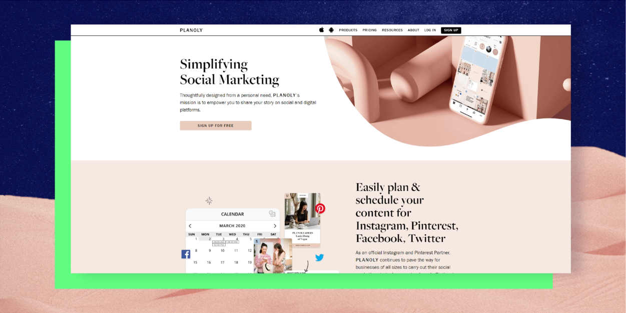
3. Don’t overload your website header design
Your website should be informative, but too much text or busy visuals can overwhelm or confuse your visitor. The best website headers should help your visitors quickly decide whether your offer is for them or not, and the keyword there is ‘quickly.’
Planoly’s header is an excellent example of this. The cohesive, millennial pink color palette and artsy graphic highlight the brand’s design-forward aesthetic, while the copy and call to action communicate the brand’s purpose and mission.
4. But don’t go too minimal, either
Too little copy or overly minimalistic visuals doesn’t work so well either. As mentioned earlier, you only have about 15 seconds to grab your users’ attention, so if they have to work too hard to figure out what you do or how to navigate your interface, you’ll lose them (and likely for good).
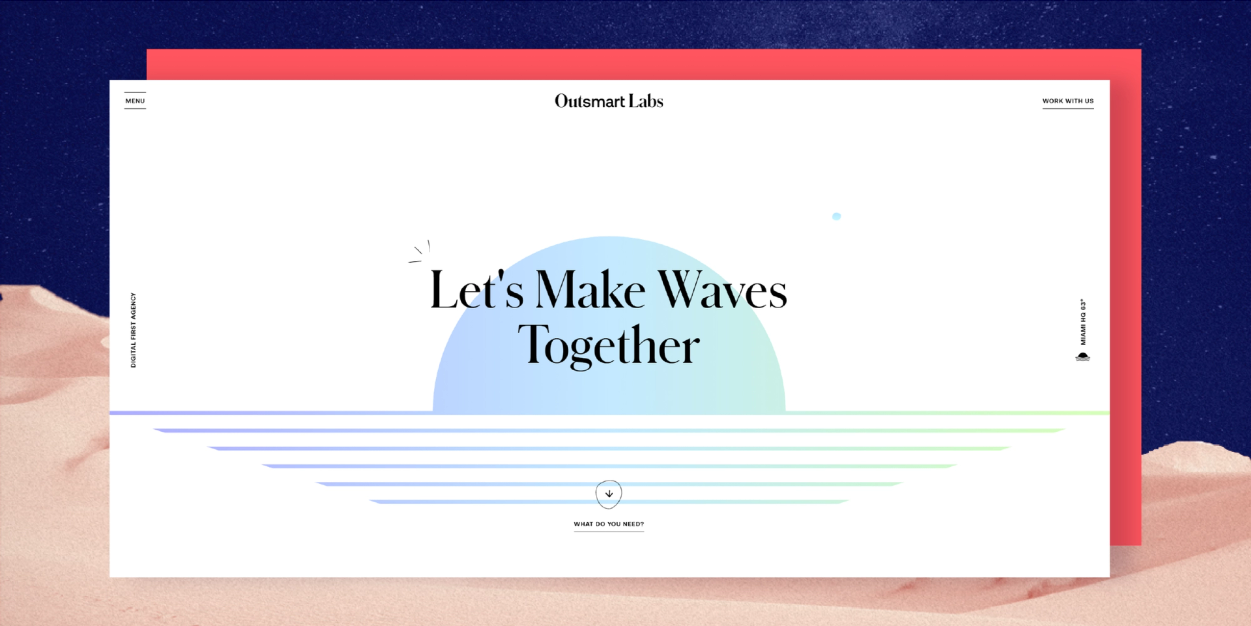
Take this header from digital marketing agency Outsmart Labs, for example. While the interactive sunset graphic is fun and unexpected, the company tagline (“Let’s make waves together”) and CTA (“What do you need?”) don’t offer a lot of tangible insight into their service offerings. Potential customers have to scroll down below the fold to get more concrete info. This is an example of going too minimalistic (something you shouldn't do)!
5. Use clear, readable fonts
Funky fonts may be trendy, but when it comes to your website header design, you should go with one that’s clear and easy to read. The copy in your header should help guide your audience, so if your visitors can’t understand it, it’s not doing its job.
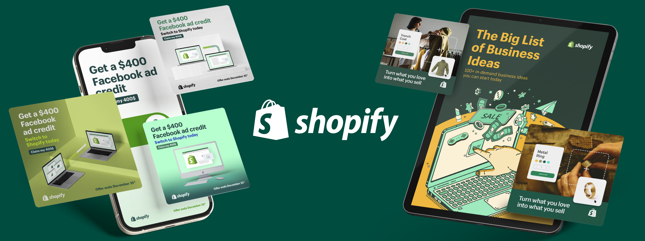
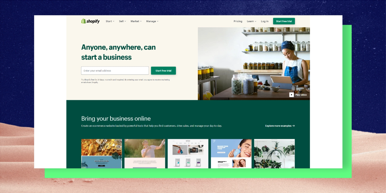
This website header from Shopify uses a simple yet bold sans serif font that really pops off of the page. The high-contrast color palette (pale beige and dark green) also helps boost readability.
6. Use illustration
A website header offers a lot of visual real estate, so consider adding a little extra flair by incorporating illustration into your header design. Illustration has become increasingly popular over the years. However, these design styles are still a little more unexpected than your traditional brand photography and can help you catch your visitors’ eye.
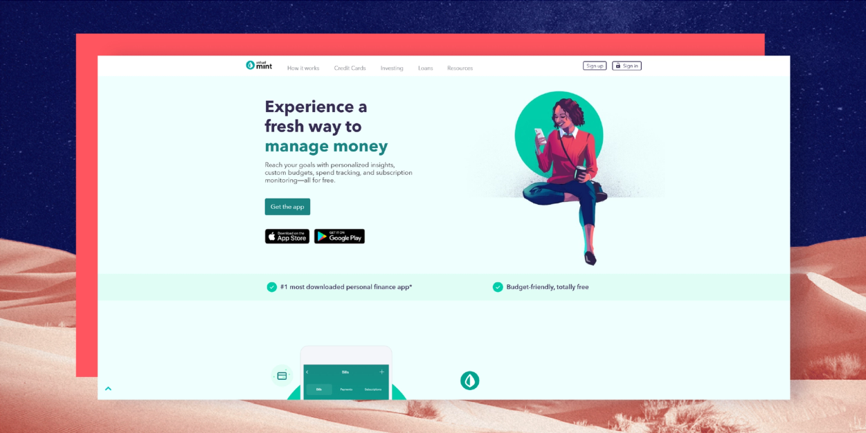
We love how budgeting app Mint uses illustration in their website header design. The resulting design feels much more youthful and fresh than one would expect from a financial tool’s website, while still feeling on-brand thanks to the consistent use of brand colors.
7. Make it move
The use of animation in website design can help to capture attention, showcase your product/service and much more. It can also make your overall website design much more memorable.
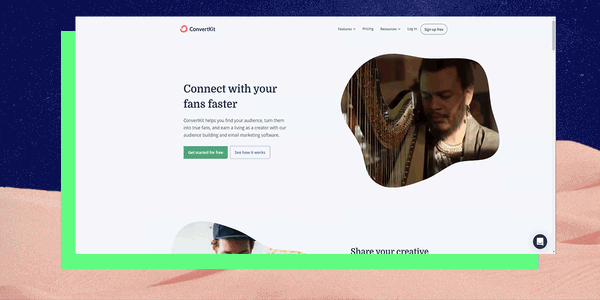
We love ConvertKit’s use of animation in their website header. The hero visual – a photograph that transforms into an animated flowchart – perfectly illustrates who they serve and what they offer in a really compelling and creative way.
Final Words
An effective website header design should hook your website visitors in and keep them scrolling down to the very end of the page. It can also be a great place to get creative and try out some out-of-the-box design ideas but at the end of the day, remember that it’s not about you – you’re designing for your customer. Have fun with your header design, but also test out different color combinations, visuals, and text to find the layout that works best for your company and your marketing goals.

You may also like these
5 Expert-Vetted Web Design Trends to Use in 2025
As businesses prioritize a standout customer experience (CX) from the moment a lead lands on their website through their first purchase, top website performance is a priority for constant success and reduced churn rates.Just last year, the global web design market was valued at $56.8 billion. Top brands know the power of modern web design at each step of the customer journey... And they won't risk it.Did you know that 39% of website visitors lose interest when they step on slow-loading images? Enterprises lose $2.6 billion annually only on this bad practice.The latest web design trends for 2025 not only help your brand avoid bad web design practices, but they’re crucial to delivering amazing brand experiences that translate into positioning and higher returns on investment (ROI).Keeping pace with current web strategies helps companies attract users’ attention and makes their journeys smoother. Whether your company is launching a new website or needs a full redesign, Superside has the expertise to support you with a key website design that speaks for your brand and empowers customers to take the next step with you.
9 New Examples of Effective Website Homepage Design to Inspire
You can have the most beautiful website in the world, but if it doesn’t convert your leads into customers when you need it to, then there’s something lacking in your homepage design. After all, your homepage is likely one of your highest trafficked and converting pages.If you’ve been looking for inspiration on ways to bump up those website conversions by tweaking your homepage elements, then you’re in the right place.In this blog post, you’ll find the best home page design examples, made to convert prospective customers and make a great first impression. We’ve also outlined some quick homepage tips and tricks that you can take with you to start optimizing one of the most important pages of your website right away.The ROI of Homepage Design in 2025The ROI of a well-designed homepage goes beyond aesthetics—it directly impacts brand trust, user engagement and conversion rates. Your homepage serves as the digital front door to your business, often influencing a visitor’s decision to explore further or leave within seconds. A strategic homepage design combines intuitive navigation, optimized visuals and compelling calls-to-action to guide visitors seamlessly through their journey, resulting in measurable business outcomes.
10 Best Website Animation Examples & Tricks of 2025
Animations are cool. That is a well-documented fact, not an opinion (trust us). Remember back in the late 90s when GIFs and early animations proliferated? How long has it been since you thought about the Hamster Dance or Peanut Butter Jelly Time? Those early viral animations are the predecessors of the stunning, refined animations we see today.People like interactive graphical elements. This is attributed to the average human attention span of eight seconds (according to a 2015 study by Microsoft Corp). Videos and animations keep people engaged, keep the eye moving and may even be used to draw viewers to the CTA. Research by the Online Publishers Association showed that over an eight-month period, 80 percent of users had watched a video ad, and of those, 46 percent had taken a follow-up action.Let’s check out the 10 best website animations so you can get some inspiration for your web pages or learn how adding animations (effective ones) can completely revamp web design.Understanding Animation in Website DesignWeb animation is any motion that is on the web, and though Flash is not used as much now, there are many techniques and technologies that bring the Internet to life: