6 Typography Trends to Look Out For in 2023

Have you ever heard the phrase “It’s not about what you say, it’s about how you say it”? That’s true of typography (well, almost: what you say still matters very much). Typography accounts for more than just combining popular fonts with complementary colors.
Typography is a key marketing tool and an important part of any UX design. Two well-known examples are Coca-Cola using their iconic typography as the main design element in their ‘Share a Coke With’ campaign, and Google’s continuation of the ‘o’s’ to become Goooooogle when users click past the first search results page.
Alrighty, Let's Dive In!
Trend #1: There’s a New Serif in Town
Trend #2: Vintage Fonts Are In
Trend #3: 3D Typography Isn’t Going Anywhere
Trend #4: The Rise of Unique and Interesting Typefaces
Trend #5: Combining Colors and Fonts
Trend #6: Using Typography for Information and Emotion
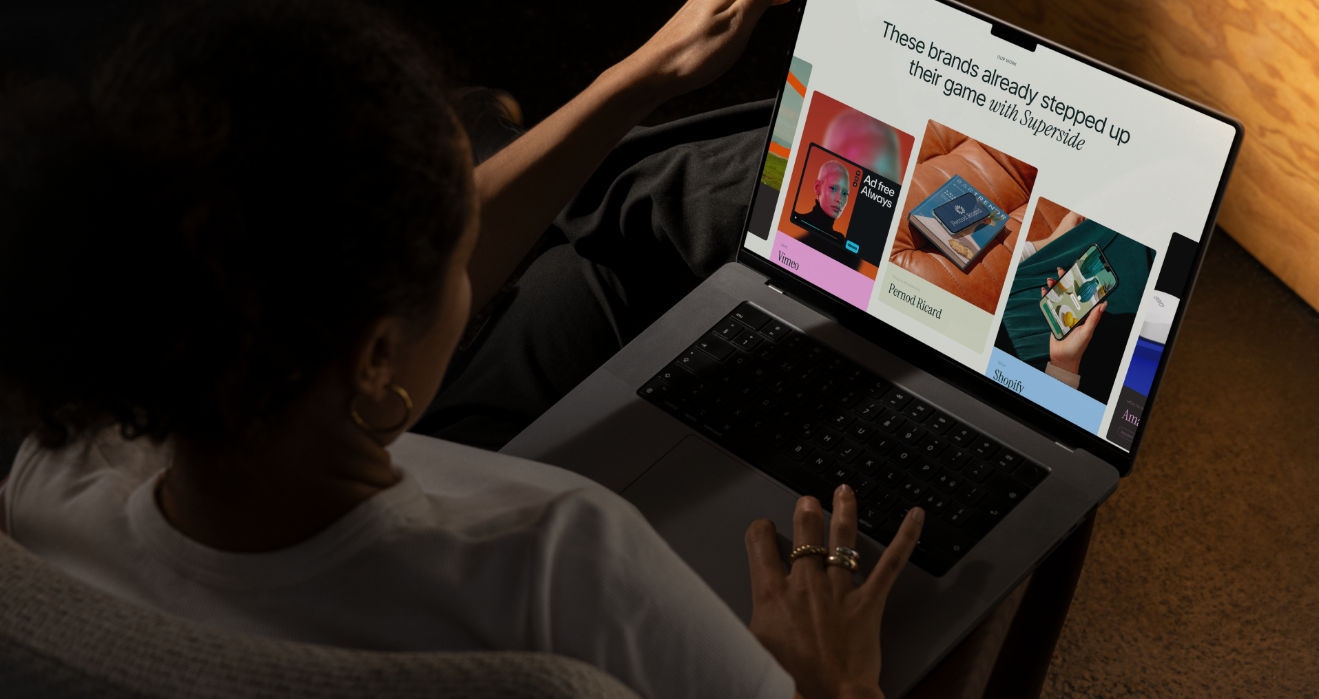
As for how less recognizable corporations can make the most of typography in their marketing and UX, it’s important to be aware of the latest typography trends and how to use them. You can also consult the experts and get a range of branding services tailored to your business with Superside.
These are our picks for the 6 biggest typography trends for 2023:
Trend #1: There’s a New Serif in Town
The more contemporary sans serif is starting to fall out of favor in comparison to the timeless serif typeface. After years of minimalist designs in fonts, trends suggest that 2023 will see a shift towards classic and elegant serif fonts. The reasons for the shift are twofold: sans serif typography has become largely saturated, and the callback to the traditional serif fonts creates a strong nostalgic tie.
(What’s the difference, you ask? Serif typefaces have those decorative tapers and lines at the hard edges of every letter. Sans serif typefaces do not - hence sans).
Beautifully sophisticated, serifs suit some industries better than others. Picture a comic book store with a tall, thin-letter serif logo; it may be visually pleasing in isolation, but it’s totally incorrect for the business and will look and feel out of place on the storefront.
Serif fonts are a good match for the following industries:
- Journalism
- Finance
- Tourism
- Interior design
- Fashion
- Beauty
- Consulting
- Real estate
Our top 3 serif fonts for 2023 are:
- Hacky. Designed in 2020, this classic serif typeface has been given a modern twist.
- Ogg. Inspired by calligraphy, Ogg has multiple weights and 10 different fonts to work with.
- Bespoke Serif. Designed in 2021 with ease of readability in mind for print and digital, Bespoke is perfect for body text.
Hacky Fonts examples
Trend #2: Vintage Fonts Are In
The retro flat design style of the 70s made a resurgence in 2022, with many brands going the way of bright, flat colors and friendly, almost doodled iconography.
This style is characterized by pronounced black outlines that compartmentalize individual elements. Typography plays an important role in the retro style, making use of bold, eye-catching typefaces.
This design lends itself to rounded-letter bubble font types and a recessed border to create that retro 3D effect.
Vintage fonts can also be used to give brands a sense of weight and class. When paired with the right pastel color palette, the aesthetic strength of a vintage font is imposing and impressive. The selection of the color and font must harmonize with the brand and its purpose; without this natural cohesion, any effect other than visual appeal will be greatly reduced.
Our 3 most popular vintage fonts include:
- Summer of ‘76. This classic multi-line font is the go-to font for creating that perfect retro feel.
- Saturday Night. Thick lines, exaggerated letter edges and all the right curves in all the right places, the Saturday Night font family instantly brings that old-school feel-good factor.
- Sentinel. This stylish serif typeface is both nostalgic and timeless.
Trend #3: 3D Typography Isn’t Going Anywhere
3D typography has been a popular choice with designers since 2021. The bold lettering quite literally stands out and is, more often than not, the main focal point of the design or advertising piece. Because it exists in a 3-dimensional space, this is an excellent typeface choice for video and animation or when used on a flat, single-color background.
Using basic design software, any font can be converted into a 3D rendition of itself. Other fonts have been created purely to make the most of the 3D effect, beautifully blurring the line between typography and design.
Some of the more popular 3D fonts include:
- Fuse. This neon font is a classic: the letters are composed of neon tubes, right down to the gentle glow and smooth, rounded corners.
- Marquee Lights. Always wanted to see your name in lights? This is the font for that!
- Grass Bold. Give any environmental message a unique, complementary design. As the name suggests, this font uses cut grass to create letters.
Trend #4: The Rise of Unique and Interesting Typefaces
The stretched-letter typography trend of 2022 will continue to evolve, giving rise to bespoke fonts. Good designers will lean into this, enabling brands to adapt existing typefaces into quirky, interesting fonts that reflect their brand personality.
This can be achieved in a number of ways:
Experimental Typography
Mixed fonts. Inverted letters. Icons or images in place of vowels. Experimental typography will look to break the mold of expected typography and instead give the designer freedom to create something truly one-of-a-kind. Legibility needs to remain, but past that there are no real rules or guidelines to follow.
Flared Fonts
Looking to add a little something extra to an already established font? Flared fonts are a great way to take a serif or sans serif typeface and give it that dash of brand personality. By making slight adjustments such as increasing the weighting or space between the letters, or justifying a certain letter to sit slightly higher or lower than the others, brands can build a memorable and instantly recognizable typeface.
Distorted Typography
Distortion is similar to experimental typography, if not as far out. This typography trend takes existing fonts and gives them a twist, either by knotting or melting letters, or shifting the form of the letters into something completely new. A well-designed distorted font will remain completely legible even though it has been completely manipulated. Cobya is a good example of a distorted typeface, as is Glitch.
Trend #5: Combining Colors and Fonts
Color has always been one of the most important elements in design. The early 2010s were awash with bright, attention-grabbing colors, eventually moving on to take a back seat behind the popular pastel and putty colors and style of 2020. This movement is evolving towards luxuriant, tonal colors like emerald, deep orange and rich navy.
Expect a breakaway from the standard pairing of fun fonts with bright colors and elegant fonts with monochromatic colors. There is a surprising harmony to be found in chunky white text on a soft, powdery background, or a sophisticated serif font displayed in a vibrant rainbow gradient.
Trend #6: Using Typography for Information and Emotion
Brands wanting to form an emotional connection with their audience can do this not just with their messaging content, but with their messaging aesthetic too. This typography trend focuses on organic, expressive lettering. It adds a human, approachable feel and helps inject brand personality into the font itself.
Our choice for the top 3 expressive fonts are:
- Imani serif. Warm and welcoming, this friendly font has a handwritten feel with just a hint of formality.
- Summer. Light and cool, this font feels like summer whether used in color or in white or black.
- Deluce. A suave luxury serif font that exudes wealth and class.
Find Something Just Your Type in 2023
Finding and following the right typography trends for your business is essential to a good marketing strategy. Whether you’re looking to cement your position in the industry or rebrand entirely, choosing the right font to represent your brand is crucial.
The good news: we’re here to help. Learn how Superside can assist you with branding solutions that create unforgettable content for your audience.
Sofie is an SEO and content specialist. From being a journalist at your daily news television broadcast, to producing films and writing travel blogs; she has ended up at the more technical side of content and has a nose for sniffing out the creative pieces that will make your competitors look like digital noobs.
When not busy operationalising Content, she is happily cooking up a storm, hiking through the mountains or searching for the best flight tickets to her next travel destination.


