6 Social Media Design Tips to Increase Engagement

In a world where 500 million Tweets are sent each day, 500 hours of video are uploaded to YouTube each minute, and 8.95 million photos are posted on Instagram daily, it’s important that you stand out.
The best way to do that? Great social media design.
In fact, after surveying over 200 marketers, Venngage found that 11% of marketers spend more than 20 hours per week producing visual content. Furthermore, 49% of marketers said that creative marketing design is essential to their marketing strategy.
It’s clear that social media graphic design is an important component of any great marketing strategy. That’s why we’ll be walking through 14 social media design tips.
But first...
What is Social Media Design?
Social media design encompasses any graphics associated with your social media accounts. From your social media’s banner image and profile picture to the meta images you use for your blog posts, these graphics play a key role in engaging your audience and enticing them to take the actions you’d like them to take.
Some common social media actions that can be mapped to key metrics are:
- Likes
- Impressions
- Retweets
- Comments or replies
- Shares
- Pins
- Upvotes
- Followers
- Click-through rate (CTR)
6 Social Media Design Tips and Examples
If you’d like to turn your social media accounts into community building, revenue-generating channels, here are some tips and examples to help spruce up those post designs!
1. Be consistent with your social media designs
We can’t stress this enough.
When it comes to your social media graphics, it’s important that you stay true to your brand identity. From your colors and fonts, to the different design elements you use within those graphics, everything needs to weave into a cohesive story. A consistent brand identity will ensure that, over time, your audience will recognize your brand based on design alone. The familiarity will also help catch people’s attention over and over again.
Take Burger King for example, they consistently use the same tones and fonts across their brand. Whether it’s highlighting their delicious Whopper or their mascot, Burger King’s design consistency has made their brand easily recognizable by the masses.
2. Use social media templates
One of the easiest ways to ensure that you’re keeping a consistent brand across all of your social media images is to use templates. By developing social media templates, not only will you save time on creating your graphics (yay!), but you’ll also leave little-to-no room for veering off of your brand’s style.
The best way to implement social media design templates is to:
- Break down the types of content you’d like to post across each channel
- Create a template or outline for each post type
- Include multiple color and layout options for each template you create
- Create your images and share on social media!
Creating templates will also make it easier for teams who choose to outsource their design efforts. Whether you’re getting an external designer to create the templates from scratch for you, or build off existing ones, this is a major time saver.
Some examples of templates you may want to create are:
- Quote images
- Tip carousels
- Blog features
- Top 5/10 lists
- Statistics
- Product images
- Company updates and announcements
- Company culture shots
- Webinars or other live sessions
- Event promotion
- Sales, deals, and promotions
3. Entertain, engage or inspire
When planning out and designing your social media posts, a great strategy to ensure you’re not just posting for the sake of posting is to categorize each post into one of the following:
- Entertain: The goal of these posts are to get a reaction out of your audience—whether it’s invoking laughter or tugging at their heart strings. Don’t focus on driving your audience back to a landing page or to purchase a product, though it might still push people that way in the end.
- Engage: For this category, cater your content to get your audience to engage with that specific post or your brand as a whole. Whether they like or comment on your post, share it with their friends, save it, or click through your CTA.
- Inspire: These types of posts are especially popular for businesses that sell things like cookbooks, interior design, makeup, influencer marketing, you name it. The purpose of these posts are to inspire your audience to take action for themselves, whether it’s a kitchen remodel or improving their email marketing campaign.
TikTok has been a huge proponent of inspire-esque posts, like this one:

“Learn to live by a content calendar. Even if you don’t have your posts scheduled weeks out, at least have a plan in place that aligns with your current business goals to guide your way. Identify your main post topics as those will be the bulk of your social posts and ensure you’re creating content that supports your brand messaging and increases brand awareness.”
— Sara Buckley, Social Media Director at The Buzz Brand
4. Make it worth sharing (or saving)
Time is valuable. If your audience is willing to devote more than a few seconds to your social content, then you’re likely doing something right.
But viewing something is just the beginning—you want them to take action in some way, which in turn helps boost your content within the social algorithm. The more engagement your post sees, likely the more people each platform will end up showing it to.
“Sharing authentic and human content, insider videos, and behind-the-scenes stories work well to grab attention, pique curiosity, and eventually spark passion from your fans and followers.”
— Julia Campbell, Founder of Campbell Social Marketing
When it comes to shareability, the graphics you create to accompany your content can have a major impact on:
- Catching a viewer’s eye in the timeline
- Giving your audience a taste of what to expect from your content
- Enticing someone to click through or share your content
From the on-brand page header image to the enticing video thumbnails, MAC Cosmetics does a great job when it comes to their YouTube channel art designs. When looking at their YouTube page, you’ll see that in every video thumbnail, they add a descriptive line about the content they’ve created, along with a visually enticing image:
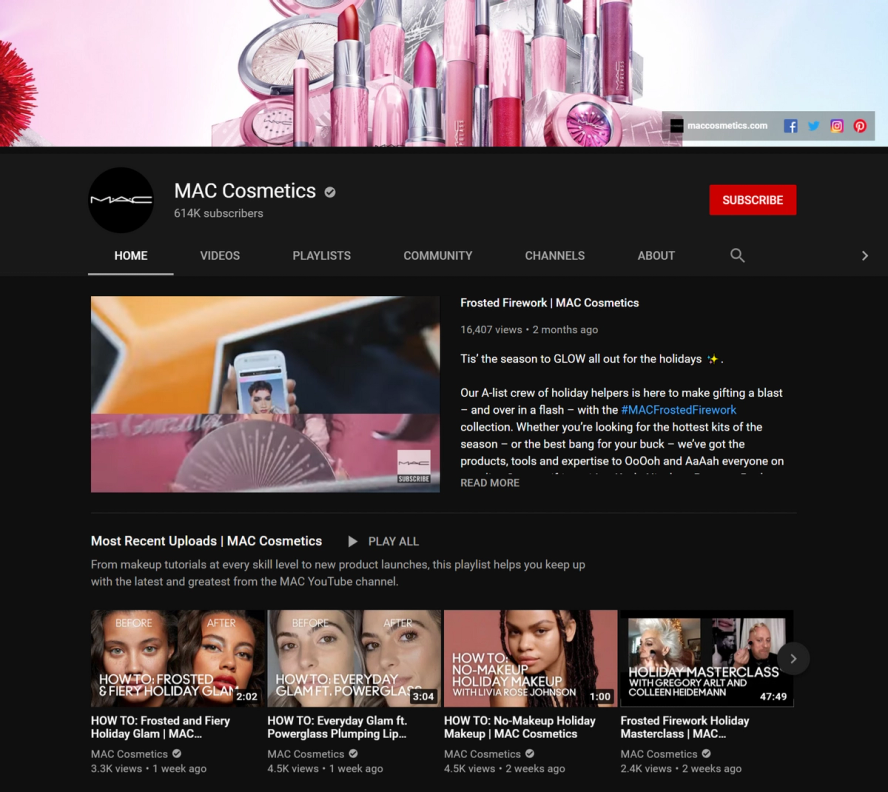
Not only do these descriptions offer viewers multiple ways to understand what the video is about, but the design elements used are also consistent and on-brand (now you see why we put that as our #1 tip).
5. Don’t be afraid to *add a little bit of spice* to your social graphics
If you’re unfamiliar with the recent TikTok trend of *adding a little bit of spice* this might go over your head. But to give some context, people all over the world are:
- Taking “boring” or “outdated” spaces, and designing them to be fresh, eye-catching places
- Sharing life before and after a product
- Sharing their appreciation for the products they love
*Adding a little bit of spice* can be said for your social media designs, too.
While simplicity is never a bad thing, many people default to using a white background. But, when you think about it, most social media platform feeds are already white. To help your images standout in a never ending feed, take a creative step in the right direction by adding a little *spice* and color to your graphics. Make them *pop*, if you will. Using creative illustrations is one way to go about this.
LuluLemon is a great example of a brand that steps out of its minimalist comfort zone on social media and ad designs, leveraging bright background colors that really capture your attention:
6. Use your fans to promote your brand
User generated content (UGC) for the win (FTW)!
The best way to connect with your customers? Amplify their voices and show off your products or services from the real people who use them. After all, they loved your product so much that they decided to share it with their network.
On top of connecting with your customers, using UGC opens up your pool for potential product shots and overall social media design inspiration to help you level-up your creative. Companies like Glossier do an excellent job at this!
When looking for UGC, you can check:
- Any photos your username has been tagged in
- Any photos your geographic tag has been used on (great for restaurants, retail, coffee shops, etc)
- Any mentions of your brand name
Oh, and you can also just flat out ask your customers for some content by doing outreach in places like your newsletter campaign or on social media.
Speaking of, many brands actually collect UGC by running contests on social media that get people to share a photo/video with the contest hashtag—usually for a chance to win something in return.
A great brand that does this is WW (formerly Weight Watchers). Throughout their feed, they share customer stories on how their product helped customers change their lives. They don’t need high-quality photos, just simple, on-brand design and real images by real people.
Wrapping up
Social media design plays a big role in the success a company experiences from this powerful marketing channel. Particularly for B2C companies out there—social media should be your jam!
So, if you want to succeed with social media design, implement some of the tips we discussed today:
- Keeping your designs consistent
- Taking advantage of templates
- Entertaining, engaging, and inspiring your audience
- Designing images for shareability (or savability)
- Adding a little *spice* and color to your designs
- Leveraging user generated content
If you’d like an extra set of expert hands, Superside offers marketing and social media design services from our global team of over 100+ designers.
Cassandra King is the former Head of Content & Community at Superside. She’s a road trip aficionado, advocate for all things glitter, and can usually be found with a camera (or snacks) in hand. Find her on IG @casssandra.king.
