•Ad creative
Eye-catching designs that perform•Social media creative
Engaging assets for all platforms•Presentation design
Captivating slides that tell your story•Illustration design
Visual storytelling for your brand•Branding services
Expertise & custom design services•Email creation
Click-worthy emails that drive engagement•Web design
Stunning websites built to engage•eBooks & report design
Your digital content superchargedTop 5 Motion Graphics Design Tricks

Motion design or motion graphics is a type of animation that creates the illusion of movement or rotation. Think back to some of the most recent ads you've seen on Instagram—chances are that they contain some form of design in motion. From moving text bubbles, to illustrated characters walking through a scene, motion graphics come in many shapes and forms.
Motion graphics are great for:
- Explaining a complex topic
- Showcasing a new product or feature
- Building brand awareness
- Differentiating a company from it's competitors
- Storytelling or self expression
See the below example which combines text with images and other graphic elements, putting it all into motion in a seamless video.
Whether you're a product leader, marketing manager, or even motion graphics designer yourself, you know that the need for movement in design is ever increasing. But, it can strike fear into the heart of anyone who needs to put content out into the world. Why? Because getting regular design done well and at scale is hard enough; now the world expects it to move as well? Come on, one layer of complexity at a time.
If you’re feeling like motion design is a mountain (or even tiny little mole hill) to climb, these 5 tricks and treats should nudge you ever so slightly up that steep slope. This is not a motion graphics tutorial persay—that's what YouTube is for. Below are the key motion graphics animation tips that I've learned over the last 9+ years as a design leader and creative director. I've also provided some sweet motion graphics examples to help give you a little inspiration.
BONUS: you can check out my talk on the value of motion design in marketing and growth below. We had an entire Gather & Grow webinar on this (they're free to join).
The work in this video was created at Ogilvy South Africa in partnership with the Kinetic during my previous role.
Trick 1: Process is Key in Motion Graphics
Good process is the formula to success when it comes to anything and everything motion design. All you have to do is follow the formula, right? For some unknown reason, if there's a process, people will fight against it with torches and pitchforks. This happens for many reasons:
- Sometimes it seems that much easier to simply skip some steps to shorten the path to success.
- Content budgets are teeny tiny and no one wants to waste time on things like ideation, gathering moodboards, research or storyboards. That's a luxury only Pixar can afford! You want to jump straight into seeing the thing move and reap the rewards.
But if you skip the process and put the cart in front of the horse, you’ll end up patching up a splintered cart, and putting your wonky cart on social media for the whole world to see.
Newsflash: nobody wants to see your wonky cart. 👀
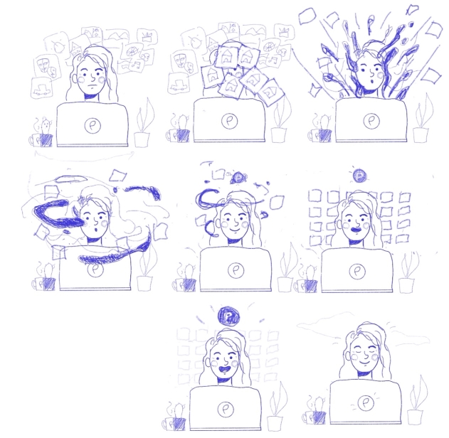
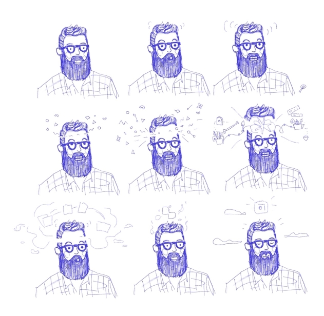
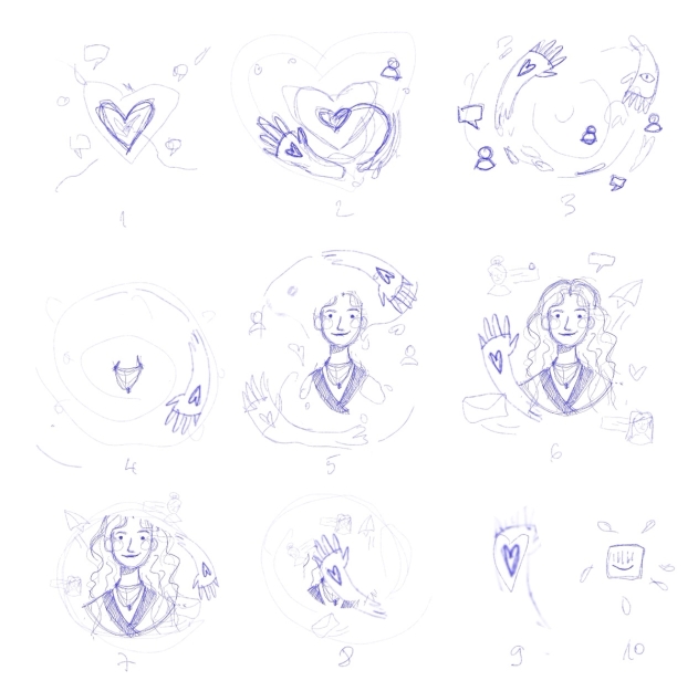
Below are a few examples of rough storyboard sketches one of our designers worked on, along with the final motion design. This process helped our designer plan out how the motion will look, feel and act before actually getting into any software.

There's of course a standard graphic design process you can follow to make sure designs are flowing smoothly, but for motion design there are a few key steps you don't want to miss.
5 steps to follow when creating a motion graphic:
Step 1: Research & ideation.
Step 2: Moodboards
Step 3: Storyboards
Step 4: Design the static frames
Step 5: YAY! animation time
DESIGN TIP: Check in multiple times during a step. Make sure to do a complete sign off before moving on. You need to be 100% happy, don’t be half the way happy and think the next phase will fix the problem. It won’t, the next step builds on what is there and doesn’t fix what's there.
A process treat for the eyes:
For longer explainer videos there's no room for skipping a step in the process. Here we can also see the storyboard process briefly documented in the Behance link.
Behance: AZA Explainer Video by Dinos & Teacups
Trick 2: Design it, Don’t Be Lazy Now
As explained in the process, the static design step shouldn’t be skipped and lumped into the animation phase.
Give the static design it’s own room to be experimented with. When graphic design and motion get mixed together, one of the steps will be deprioritised, and it’s often the graphic design part. You’ll end up with moving 💩. It will be a glorious animation of 💩, but 💩 nonetheless.
Design is fantastic and motion is fantastic—if you give both of these the time they need to shine, you’ll end up with something truly polished.
Something to consider is having two roles on your project:
- Have a designer for your design
- Have an animator for your animation
Sounds simple. You can get designers/animators rolled into one neat package, but what I find is that they will be more inclined to either design or animate even if they can do both. (There are exceptions of course.) The process is also split out for this very reason, it leaves space for this “one magical unicorn” to think about the design and animation separately.
You can hire in house or use an agency, but whatever your choice, make sure this process is clearly outlined.
If you want the best results, get two people. Two brains are better than one. There's a reason why movies have long lists of credits. 😉
A two in one treat:
Feast your eyes on what happens when design and motion merge into one.
Behance: Pandora - The Great Indoors
Trick 3 : Make it Short. No, Even Shorter!
Depending on the purpose of the brief of course, shorter is almost always better.
Condense your messaging and story as much as you can. Not only will it take longer to animate and be more costly, but the person on the receiving end will probably lose interest.
A designer knows he has achieved perfection not when there is nothing left to add, but when there is nothing left to take away.
- Antoine de Saint-Exupéry, French writer and poet
The attraction of short-form social videos lies in their “snackable” nature. It's one of the core principles of great social media design.
Short videos suit busy lives, brief attention spans and the need to consume content quickly and easily. Because most people consume content on their mobile devices while on the go, the shorter the content is, the better.
If you’re a brand on social media, you are most likely interrupting your audience’s browsing. They are in the middle of interacting with friends, family and entertainment, and your brand video is the third wheel. So make it short, make it sweet and make it worth their while, then get out of the way.
Short and sweet treat:
These very simple-animated designs show you that if your motion design is strong enough, it can be:
- Short and to the point
- The movement can be minimal
- It can be used to highlight a few elements
Just enough motion to grab the attention of someone scrolling on social media or walking past an outdoor digital display ad.
Click on the images below to see the designs in motion.
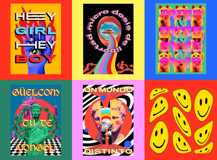
Behance: Emily López
Trick 4: It's Time—Craft That Animation
Now that we’ve spoken about following the process, along with focusing on design and making it short, all of our attention can go towards making the animation look as good as humanly possible. It’s short, so it should be quick right?
The time it takes to pull off good motion work is very often underestimated. It requires a goooood chunk of time and dedication. Even a bouncing ball can take hours. It may look easy, but once you start to move keys around and begin animating, hours can tick away. Give your animator the space and breathing room they need. They got this, but they don’t got this if you are impatient.
The animator has many things to consider—from the 12 principles of motion to rendering, the best gift you can give them is the gift of time (and money, remember to pay them).
Make sure to check in on progress, of course. But set realistic deadlines that the whole team feels comfortable with.
Time consuming treat:
Quick to consume but long to animate. Craft has been injected into every millisecond of this motion graphic. This was not an overnight job, but proper space and breathing room must have been given to this team to work their magic.

Behance: Believe - Reel '19 / '20
Trick 5: Do it Better Next Time
You can always do it better.
Do the process better:
Like a beautifully crafted animation, you can also craft a process. Very often the first or second or third time will be rough. People will shout, people will cry and people will crawl into the fetal position. Make sure to take learnings and apply them so that it gets easier over time.
Don’t run the same old process over and over again expecting a different outcome.
And just when you think you have it down, glorious wrenches will be thrown into the works, forcing you to adjust or change your process. Don’t try to force fit a new challenge into an old process. Improvise. Adapt. Overcome.
Do the motion graphics better:
The 12 principles of animation don’t change but it’s like learning to play the piano, it takes years to master. The more you animate the better it gets. But be careful to not become such a well oiled efficient machine that all creativity goes out the window. Always leave space for new ideas and new approaches. Keep your eyes on trends and hell, why not leave some space so that you can forge some new trends.
Trendy treats:
And lastly here is a treat that speaks about the biggest motions trends of 2020, stay in the know.
If you need motion design but don't have the resources in house, we can help! We've recruited top motion graphics artists and animation talent from across the globe, and even put our team through motion design training. Just check out our sizzle reel below featuring some work we've done for customers.
Needless to say, we've got you covered with our Motion graphics design services.
Now go forth and conquer your motion fears, take it slow and make it worth watching.
Anneke King is an Executive Creative Director at Superside, where she grows processes, design teams and clients in an effort to make the world a beautiful place. She lives on coffee and flowers and spends her spare time illustrating, having breakfast and going on road-trips. Find her on IG @anneke_king
