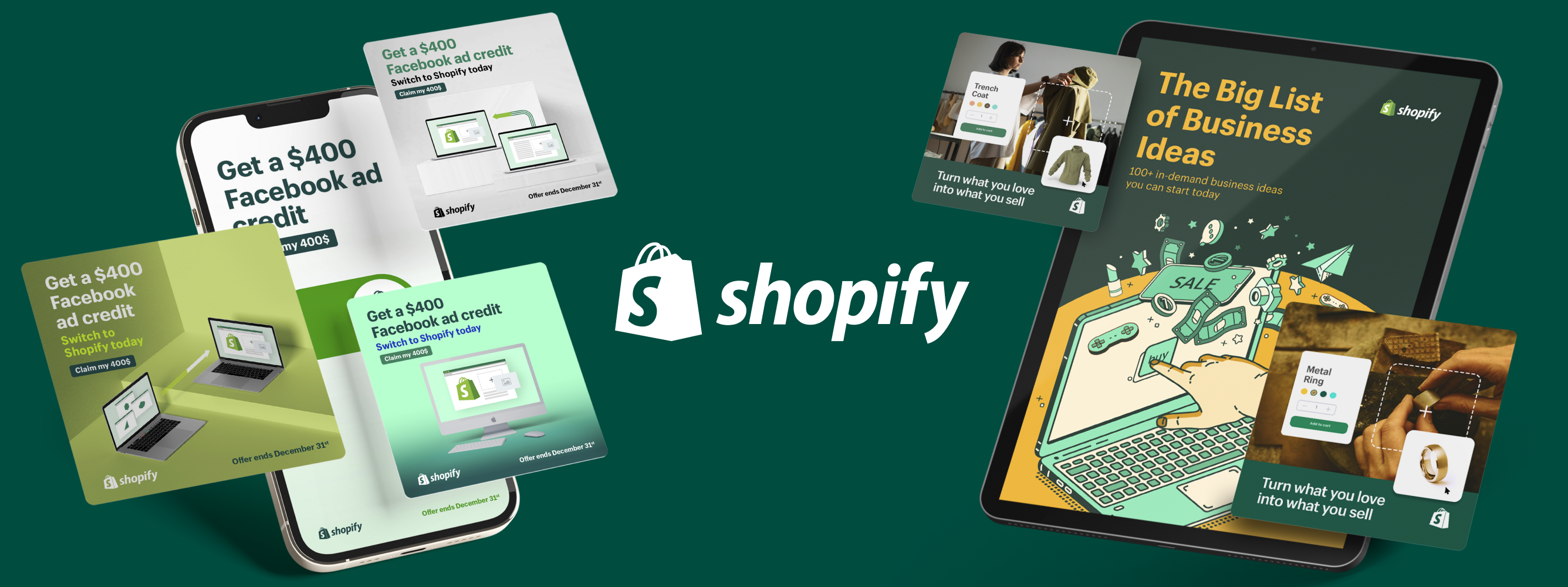
Graphic Design Portfolio Review: What You Want To See and Not See (Checklist Included)
Published 23 Nov, 2023
Even before you reach out to connect, a portfolio can tell you a lot about a design agency. A graphic design portfolio review helps you see the scope of the agency’s work as well as their overall creative approach. What should you look for? Accept nothing less than exceptional quality, strong design fundamentals, a human-centric approach, solid storytelling and proven versatility. And use this checklist to keep track of your thoughts.
Some of the first design portfolios have been traced to typesetters in the early to mid-1500s.
As universities and specialized institutions began teaching graphic design in the mid-20th century, the tradition of a designer’s portfolio was carried forward. Design agencies soon followed suit.
There’s no denying that first impressions matter. When it comes to choosing the right design agency, the first impression is often their portfolio.
As you conduct your graphic design portfolio review, you’ll see more than just the agency’s best work. Portfolios can also be a window into how the agency tackles challenges, thinks differently about a problem and brings their clients' visions to reality.
5 Qualities That Make a Graphic Design Portfolio Stand Out
What factors should you consider when reviewing a design portfolio? Here are six qualities you should look for when evaluating graphic design portfolios.
📋 Download this checklist to help with your portfolio reviews. 📋
1. Exudes Quality
No two projects are alike, but every design portfolio should showcase a consistent approach and level of mastery. Let’s say the design partner’s portfolio includes a campaign with a mix of assets like social graphics, digital ads and physical packaging. Look for a unifying thread across different projects that demonstrates their ability to maintain consistent style and impact.
What to look for:
- Originality. The right design partner doesn't just copy trends that work. Their portfolio should demonstrate unique, innovative design that engages audiences.
- Consistency. Look for a unifying thread across different projects that demonstrates their ability to maintain consistent branding and memorable creative.
- Attention to detail. Small misalignments or inconsistencies can be warning signs of a bigger problem. Even designers can use spell-check and other quality controls.
2. Reflects the Fundamentals of Design
The right design partner should demonstrate that its team has mastered design fundamentals, from balance and hierarchy to proximity and alignment. The portfolio should show that the design partner has a strong grasp of design principles.
What to look for:
- Balance. As you explore their portfolio, check to see if the design feels right to you. Even if you’re new to design, you likely know what works and what doesn’t—even if you don’t know the technical term for it.
- Elegance. Not like a formal dinner party, more like everything just fits together seamlessly. The pieces are so well done that you’re focused on the overall effect versus a white space you could drive a truck through.
- Creative maturity. You can have a novel idea, but all of the pieces have to come together. Even the most edgy approach requires a clear sense of vision and approach. You can go for it, but without overdoing it.
3. Embodies How People and Design Interact
Great design is equal parts form and function. Look for examples that show how a potential design partner makes sure its work is both visually and intuitively appealing.
What to look for:
- Grabs your attention. Effective creative, whether it's print or fully interactive, should grab your attention and pull you in.
- Flows naturally. Great designers know how to guide someone from point A to point B with as few roadblocks as possible. For instance, the images and text work together to draw your attention to the main call-to-action (CTA).
- Triggers an emotional response. While designs can appeal to your logic, next level happens when the creative makes you sense something more. Anger, tears, laughter, peace of mind—the best work makes you feel.
4. Tells a Story
Storytelling has been a part of the human experience since the start of humanity itself. Marketing and advertising are no exceptions. When the plot thickens, creative gets more memorable.
What to look for:
- Has a hook. Whether it’s a punchline or iconic image, it’s definitive and you want to see or learn more.
- Offers a unique perspective. From dancing raisins to multilingual owls, brands have been leveraging looking at things a little differently for a long time.
- Simplifies the complex. I want my ads to look like a PowerPoint slide… said no one ever.
5. Shows Versatility
Whether a design partner specializes in social media video for SaaS companies or integrated brand campaigns for a wide range of industries, the work for each client should be nuanced to reflect the needs of the brand and the target audience.
What to look for:
- Industry knowledge. Your design partner should show they understand industry standards, audiences and any unique design requirements.
- Variation. You can tell that the pieces reflect differing approaches, audiences and objectives.
- Experimentation. AR is being quickly adopted almost everywhere. AI can help with rapid iteration and even branding materials. From a color choice to the overall approach, you want to see a genuine curiosity and willingness to explore.
📋 Use this quick checklist to help review graphic design portfolios. 📋
3 Red Flags That Signal a Weak Graphic Design Portfolio 🚩🚩🚩
While personal tastes vary, here are some clear red flags that an agency has the potential to become a bad friend.
1. Lack of Quality
High standards are hard to fake. The dedication of true professionals shows through in everything they do from their innate knowledge of design principles to a keen attention to detail.
Beware of:
- Things that make you go hmmm. Not sure why they did that… maybe they’re not either.
- Things that feel clumsy or unfinished. UGC-style video is a choice. Sixteen different fonts in the same ad might require an intervention.
- A complete absence of style. Can’t see any influences or sense that there’s an overall approach? Maybe there isn’t one.
2. Click and Forget
Is sleep-scrolling a thing? If, as you review a graphic design portfolio, you find yourself clicking but not connecting, the work is not impacting you.
Beware of:
- Sameness. When all the work samples and creative really look alike, but not in a good way.
- Ambivalence. Did you just change tabs or quickly go check your messages? If so, this portfolio is definitely not reeling you in.
- Mental and emotional amnesia. Where did that time go? You didn’t think or feel a thing.
3. Apathy
Beyond quality and impact, does this agency seem to care about what they’re doing? You want to be awed, not blah’d. If there’s no passion, there’s no way to ignite the spark you need in your creative.
Beware of:
- No sense of excitement. Do they seem genuinely invested in the creative process or more like they’re just in it for a paycheck?
- No sign of evolution. Even grass grows. Does the portfolio have pieces that demonstrate the adoption of new techniques and technologies?
- No new work. You make time for what’s important. If the agency hasn’t updated its portfolio in a while, it’s worth asking why.
It Pays To Be Picky
As you research design agencies, taking the time to evaluate portfolios will really help you find the best partner. It takes time, but you’ll know a strong portfolio when you see it. And when you combine these talents with your team, you’ll lay a solid foundation for success.
It's also wise to consider the financial aspect of your decision. Utilize this design cost calculator to gain a clearer understanding of potential design costs, helping you make an informed choice that aligns with your budget and project goals.
Alex is a freelance writer and newsletter aficionado based in Waterloo, Ontario. When he’s not writing for clients, he’s putting together TL;WR, a weekly culture and events newsletter his mom says is excellent. Alex has worked with some of Canada’s largest tech companies in PR, marketing and communication roles. Connect with him on LinkedIn to chat or get ideas on what to do this weekend in Waterloo.


