25+ Facebook Banner Videos from Top Brands
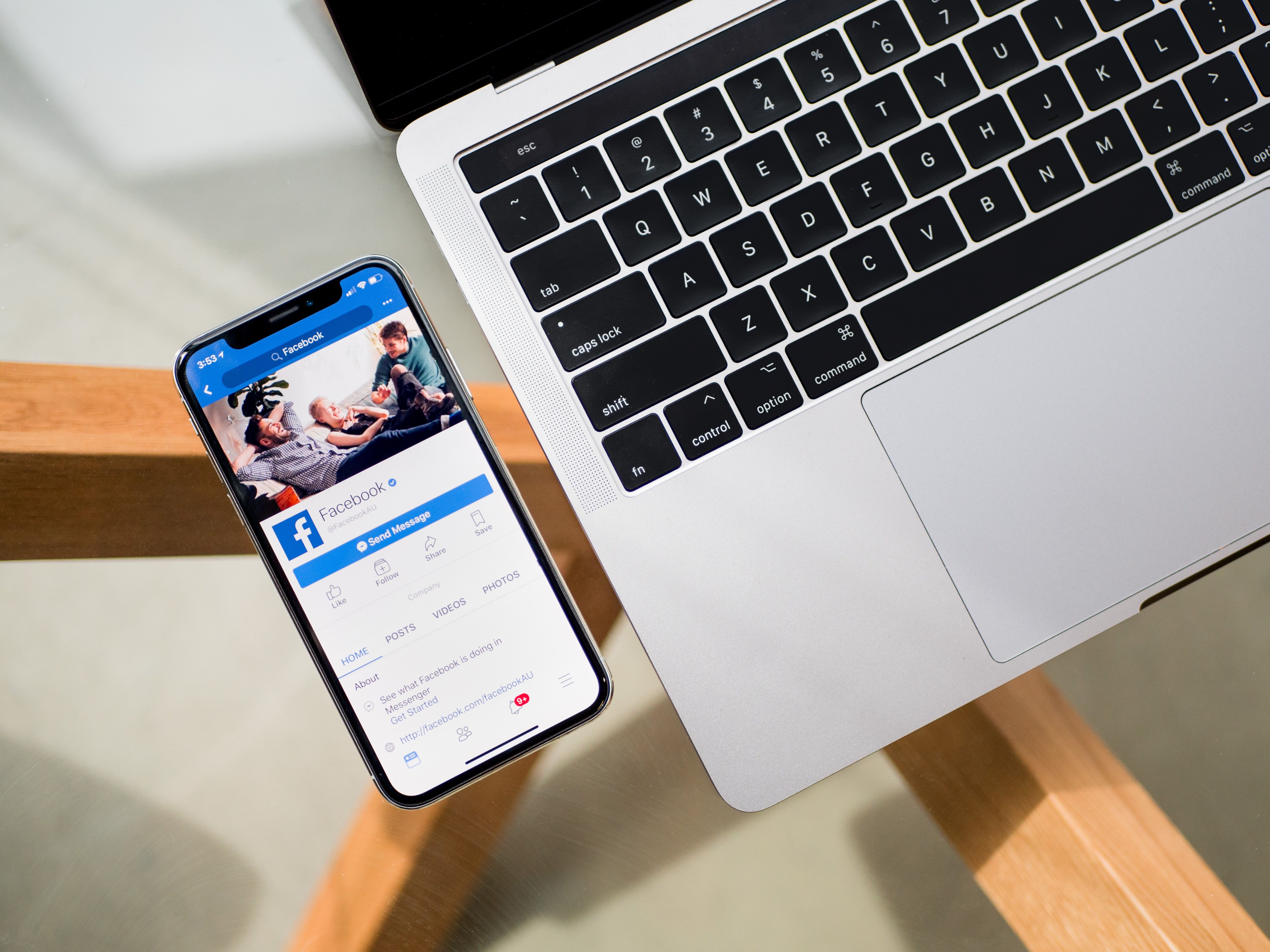
Here, at Superside, we strongly believe in the power of visual and video elements and we all agree that visual content is a huge part of a successful and effective marketing strategy. One of the best places to leverage your visual content is, by far, social media, but it also is one of the most crowded and, therefore, challenging. That's where facebook banner videos come in. With over 65 million Facebook business pages, getting yourself noticed requires work, creativity, a good strategy, and out-of-the-box thinking; it is through the little things, however, that you can make a difference.
What is a Facebook Banner?
Let's take, for example, the Facebook banner. Much like a YouTube banner, think of it as a small, but incredibly effective (and free) white canvas where you can create anything. Use it as a way of communicating with your visitors. A way to inspire and engage with them. The perfect place to tell customers more about your brand and your brand's personality.
Over the years, brands have gotten more creative when it comes to Facebook covers. Some like to keep it simple and let images speak for themselves, some use a one-liner tagline or call-to-action, while others use Facebook covers to show off their creativity and present their latest products or services. As we dive into the era of video, we've noticed a new trend: Facebook banner for the timeline. This is definitely going to be a massive hit and one of the biggest Facebook trends as businesses start to discover the immense potential video banners have.
25+ Facebook Banner Videos to Inspire You
We took a sneak peek at some of the big brands that are always ahead of the curve, and we noticed they're already using Facebook video banners. Here are the best of the best to inspire you:
1. McDonald's
McDonald's is definitely a brand that knows how to appeal to the senses, and what can be more powerful than an image of their mouth-watering burgers? In this short Facebook banner video, they used one of their most popular products—the Big Mac—and with it, they introduced two new products. The video also includes a call-to-action that appeals to the emotional side of their customers. After all, McDonald's is an emotional brand.
2. Oracle
This Facebook banner video is definitely an unexpected choice, considering it is associated with a tech company. The first reaction it triggered was surprise, then confusion, but after that we had an “Aha!” moment as we realized how brilliant it actually is. If we were to look at the video and describe it in a few words, we would probably choose cloud, freedom, speed. And what comes to mind when we think of Oracle? Innovative and secure Cloud solutions, freedom to grow, efficient and fast ways of accelerating your business towards growth and success – all elements that were subtly included in their cover video.
3. UPS
UPS doesn't need words to show what they do best in only 30 seconds: they offer fast and secure delivery services worldwide. This is the message their Facebook cover video conveys and we believe it's a really great way of reminding their customers of their efficient solutions, the second they pop on the company's Facebook page.
4. Fiverr
If you are a job portal website, what better thing to add on top of your Facebook page than a job advertisement? And if you want to really make it stand out, don't just post a cover image, but go for a banner video. It is definitely much more impactful, plus they also included the logo and the hashtag #IWantThatJob.
5. Uber
With this Facebook banner video ad, Uber manages to keep it simple but consistent with their brand image and website. They use a video that has the same graphic and colors as their other logos and explainer videos, and underlines the idea behind the company – an easy and affordable way around, anytime and anywhere.
6. Intuit
The Intuit Facebook banner consists of a sequence from the company’s “A Giant Story,” which presents the story of entrepreneur Pari who was inspired to create a giant meant to give the power of big business to everyone. This is actually a fun and original way of presenting some of the new Intuit financial products and services – TurboTax, QuickBooks, and Mint.
7. FoodNetwork
In less than 60 seconds, the Facebook banner video from Food Network shows us what their social media page is all about – a community for everything food, from recipes to tips, ideas, and cooking inspiration. The short video appeals to our senses. It triggers our curiosity, and definitely inspires us to scroll down for more quick, easy-to-make recipes.
8. Buffer
The video used by Buffer as a Facebook banner is fun, authentic, and shows off the company’s personality, motivating users to engage and connect. This is a great example of how a short 20-second video can be more powerful than words.
9. Blue Apron
We absolutely love the Blue Apron Facebook banner! It does a great job presenting the company's individuality, what they do and how they do it. At the same time, it leaves you wanting to find out more. On an emotional level, it appeals to the family instinct in us, as it recreates the image of togetherness and that of family unity.
10. Vimeo
Out of all the big brands on Facebook, it would be weird not to see Vimeo among the first ones to use video as their Facebook banner – after all, they're all about video. What is surprising about their Facebook banner video is that instead of using it as a marketing and promoting tool, they chose to use an abstract animation video from one of their users, Parallel Teeth, on the sounds of Love Survive from Michael Nau.
11. Gopro
Fun, light-hearted video about the morning routine of a man in the mountains which of course, involves using GoPro. Brilliant!
12. Business Insider
In a little over a minute, Business Insider’s cover video manages to create a relevant and compelling image of the company and what they’re all about: being where major news happens.
13. Natgeo
National Geographic has another very suggestive and appropriate choice for a Facebook banner video. In only 45 seconds, it captures the essence of National Geographic – a leading multimedia source for high-quality, informative, and detailed stories about nature, science, and the world around us.
14. Etsy
Etsy’s Facebook banner is consistent with the brand’s image and is actually a collection of some of their best products, which they also use in banners on their website homepage.
Even though Johnson & Johnson hasn’t updated their Facebook banner is a while, it is still relevant, since it presents a father spending time and playing with his toddler – a representative image of the company and its values and interests. Instead of using a video, they use a GIF image.
16. Payoneer
This is a short video, but also a great example of how Facebook banners can show off a brand’s purpose and personality. Payoneer is all about connecting people from all over the world and offering a financial solution that has no borders. This is exactly the message they manage to convey with this video, which cleverly ends with their logo and slogan, making it easier for Facebook visitors to remember them.
17. CNN
By far one of our favorite Facebook banners, the video presents one of the newest CNN services, the CNNVR – CNN’s very own virtual reality platform. They managed to take news broadcasting to the next level and not only present news, but make the viewer part of the news, through 360° videos. It instantly makes us want to learn more and linger for a while on their page.
18. Barkbox
A fun and engaging video that presents some of the brand’s newest products, while showing what the company is about and staying consistent with the company image and overall brand identity.
19. NASA
The Facebook banner from NASA’s Armstrong Flight Research Center presents a short summary of the center’s work and accomplishments so far – a great way to welcome your visitors and trigger their curiosity.
20. Starbucks
A simple, colorful, short, and to the point Facebook banner that announces a new Starbucks product – the blonde espresso. Starbucks is already a big brand and its products need no elaborate introduction or further details.
21. Samsung
Samsung uses a Facebook video banner to introduce one of their newest products and its most iconic new feature – a better camera. We love the video’s clean and sleek design, which perfectly suits their overall brand image.
22. EY
This banner video presents one of the EY campaigns – “better questions, better answers” and somehow implies that EY is the better answer. It definitely intrigues visitors and makes them scroll to find out more.
23. Deutsche Bank
Through this video, Deutsche Bank positions itself as a reliable financial partner and a universal, fast, and secure solution for businesses of all kinds and sizes. This image is consistent with the overall online presence of the brand.
24. Southwest Air
We love this short and compelling video banner from Southwest Air. By showing their customers a sneak peek of what a day at the airport looks like, how baggage is handled and how planes are prepared for takeoff, they manage to create an authentic relationship with their customers. They inspire trust and present themselves as professionals who know what they’re doing.
25. Spirit Airlines
It’s outstanding what Spirit Airlines does in a 30-second video. They constantly show the brand colors in order to keep it top-of-mind, while rotating other images that basically say “wherever you want to travel, we can take you.” The brand has a fresh, modern feel, and this video totally manages to create and transmit this feeling.
26. Trip Advisor
There are four elements that turn this video into a truly outstanding Facebook banner: it presents some of the most appealing destinations available on TripAdvisor; it includes some of the TripAdvisor reviews and tips which add to the element of authenticity; it triggers emotion; and it ends with a call-to-action. Short, on-point, and overall really awesome! You nailed it, TripAdvisor!
Facebook Banner Video Size and Dimensions
By now, you're probably pretty excited to give Facebook banner videos a try, but where to start? First, to create a Facebook banner template you need to know the right Facebook banner dimensions. Facebook requires that cover videos are at least 820 x 312 pixels, but the recommended size is 820 x 462 pixels. Banner video can be anywhere from 20 to 90 seconds long.
How to Make Your Own Facebook Banner Video
Once you have the correct dimensions, let's see how it's done. There are several ways to create a cover video for Facebook, including using Adobe Premiere Pro CC, PowerPoint or RendrFX. Here are some very useful and explicit videos that take you step-by-step through the process of creating a Facebook banner template:
How to make a Facebook banner video in Adobe Premiere Pro CC:
How to make a Facebook banner video in PowerPoint:
How to make a Facebook banner video in RendrFX:
Looking for more banner design advice? Check out our post where we cover 12 banner ad rules to follow.
Our Superside experts are here to help you by putting their creative minds to work. Project managers are available 24/7 to discuss ideas and really understand what you’re looking for. Then they choose the best social media graphic designers to put your ideas into an awesome banner video that will take your company’s social presence to the next level. Don’t forget, video is the big thing in the digital world now and is definitely here to stay, so the sooner you embrace it, the better. And one of the best ways to do so is by creating a Facebook banner video!
Built to be an extension of in-house teams, we deliver fast, scalable, world-class design and creative solutions to over 450 globally renowned companies such as Amazon, Meta, Salesforce and Google. Connect with us on LinkedIn.
