How to Design Effective Facebook Ads in 2024

2We’ve seen it time and time again. You invest countless hours and resources in crafting the perfect Facebook ad campaign, but when you log into Ads Manager, you don’t see the views, clicks and conversions you expected.
What gives? Well, it could be your Facebook ad design. From your ad placements to your ad type, there are so many variables you need to consider when creating a Facebook advertisement. However, even with all the innovations, trends and technologies that have cropped up over the years, one fact remains the same: your creative design and Facebook ad format can make or break your ads.
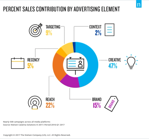
A 2017 Nielsen survey analyzed nearly 500 ad campaigns across all media platforms and identified creative as the largest driver of sales (47%). Other ad elements like reach and brand clocked in at only 22% and 15%, respectively.
Even Facebook’s Creative Research team backs up this sentiment, stating in a 2020 article that “good creative can significantly help achieve even greater campaign performance.”
Long story short, if ads on Facebook are a part of your team’s marketing mix, optimizing your ad design can seriously boost your campaigns’ overall reach and effectiveness.
In this article, we’ll walk you through:
- How to design different Facebook ads
- Tips for creating a winning Facebook ad design
- How to design effective Facebook ads
- What types of ads work best on Facebook
Let’s get into it.
How to Design Different Facebook Ads
There are many different types of Facebook ad designs that you can create but to keep things simple, we’re going to focus on the three most popular ad styles: image ads, video ads and carousel ads.
Facebook Image Ads
Creating a Facebook image ad is relatively straightforward. You don’t need to splurge on a professional photo shoot. All you need is an image that:
- Clearly illustrates what your business does
- Highlights the value your business provides
This may seem obvious, but you should try to use unique images of your business, such as product shots, custom illustrations or photos of your service. If you use stock photos, avoid the super obvious or common ones and customize them to fit your brand. For example, you can add additional design elements to the image to make it more unique, or even add a filter that fits your brand style.
You should also make sure that the image or design that you choose is well lit, nicely composed and doesn’t have too much clutter in the background.
Lastly, take into account that most users will view your ads from mobile devices and design accordingly. Make sure to use vertical images (up to 9:16 ratio) for greater impact in Stories placements and square or horizontal ones for feed placements. You can check out the Facebook Ads Guide to get the specific technical requirements and design recommendations for every ad placement type.
Facebook Video Ads
Just like an image ad, you don’t need a full production crew to create a compelling Facebook video ad, but there are some essential details that you should keep in mind. Here are a few of our favorite tips:
- Where you place your video ad should influence how you shoot or design it
- Vertical videos work great for mobile placements like Instagram stories, whereas horizontal videos are more suited for desktop ad placements like the Facebook News Feed or the Video Feed
- To make your brand really stand out, incorporate motion design (such as moving illustrations)
You should also keep your video short — 15 seconds should be your maximum, according to Facebook — and make sure it works well without sound. As you’ve probably experienced on Instagram or Facebook, video ads are usually muted when you scroll through the feed, and you can't assume that people will tap your video to hear the sound. If there is any dialogue or voice over in your videos, add in subtitles to account for this!
Overall, your video should be eye-catching and show precisely what makes your offer unique in as little time as possible. Facebook ad experts say you only get about 3 seconds, often less, to grab people's attention. Make those seconds count.
Facebook Carousel Ads
You know those ads with multiple pictures that you can swipe through? Those are called carousel ads, and you can use this format to showcase up to 10 images or videos within a single ad, each with its own link.
With more creative real estate, carousel ads are great for highlighting different products and showcasing specific details about a particular product, service or promotion. You can also use them to tell a story about your brand that develops across each carousel card, or even blends from one card to the next.
Since carousel ads are essentially a combination of image or video ads, the same rules above apply here. You should always choose visuals that are:
- Impactful
- Authentic to your brand
- And articulate what makes your offer special
There’s also no guarantee that viewers will swipe through to the end of the ad, so make sure the first visual you choose will hook your potential customer right away.
Learn all about Facebook advertising design in our newest guide. We dig into best practices on each channel, and even feature a Facebook ad case study from our friends at Outbrain. Check it out!
Tips for Creating a Winning Facebook Ad Design
Now that we’ve got the basics out of the way, let’s dive into how you can create an effective Facebook ad that genuinely stands out from the crowd and grabs your audience’s attention.
We’ve compiled a list of the most up-to-date tips from Facebook IQ research and industry experts to help you add some fuel to your Facebook ad fire in 2024.
How To Design Effective Facebook Ads?
- Use motion video and animation to enhance Facebook ads
- Add music or voice overs to your Facebook stories
- Design Video ads that can be watched without sound
- Give ads a DIY feel
- Match ad creative and landing page style
- Design ads with accessibility in mind
- Experiment with text in the main image
- Optimize the first 5 seconds of your video ad
- Test ads and measure performance
A Little Motion Goes a Long Way
Did you know that campaigns with lightweight motion video achieve a 17% higher conversion lift than static images alone?
This ad from Kelsey Murphy is an excellent example of this tip in action. She’s added some motion to the desktop computer graphic in her ad, while the product images at the bottom and the copy at the top remain static. The resulting ad is far more interesting to look at than your typical image ad and also offers more insight into her offer by allowing her ad viewers to ‘scroll’ through her virtual product.
Turn Up the Volume in Your Stories Ads
Consider adding some voice-over narration or music to your ads to enhance your message and value proposition. According to Facebook research, “stories ads with voice-over or music drove better lower-funnel results than ads without sound, with 80% confidence.”
Haircare company RevAir uses jaunty music at the beginning and end of their ad to underscore one of their key selling points. This product is so simple and effective that even a child can use it and the fun, upbeat music helps drive that point home.
Design Video Ads for Sound Off
Even though voice-over or music can help boost your ad performance, you also want to make sure your ads make sense when muted too. Studies show that branded content ads designed for sound off were rated as having “48% more relevance, 38% more brand interest, and 42% more purchase intent in lab studies.” Adding captions to video ads have also been shown to increase view duration.
Instagram marketing expert Elise Darma has background music to add some energy to the visual content. Still, the ad message is clearly communicated without sound as each image contains copy that articulates who the offer is for and what it contains.
Give Your Ads a DIY Feel
Your next top-performing ad image might be on your phone's camera right now.
If you're creating Facebook ads that will run on Instagram, research shows that mobile-shot stories ads outperform studio-shot ads in driving critical content views. On top of that, video ads with Instagram stickers to express brand messages performed better for conversion objectives.
The key to putting this tip into action is to not overthink it. For example, this ad from Happy Subscribers Toolkit is a simple Boomerang-style video loop. The company uses an Instagram stories font for the copy and adds background music for a little extra oomph. The resulting ad looks like a typical Instagram story, and that’s why it works. Here's a great ad design tip:
My winning formula is to have the client record a video themselves on their phone, and then I get it edited by my team to add in the branded elements.
- Aashima Verma, Facebook Ads Consultant
Social media users, particularly in the millennial demographic, are pretty adept at filtering out advertising messages, so DIY-style ads often perform better than more professional-looking ads because it feels more relatable.
Sync Up Your Ad Creative and Landing Page Style
Clear and recognizable branding can help build brand awareness and trust with your ad audience, and the best way to do this is to make sure your color scheme, fonts, and logo styles are consistent across all of your marketing platforms. For example, digital marketing agency SHIFT saw a 23% increase in engagement when they adapted their Facebook ad design to match their landing page.
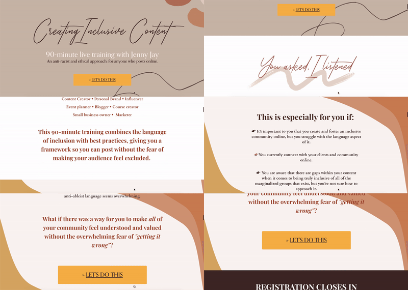
This ad from video creator Jenny Jay exemplifies this perfectly. Both the video ad and her landing page use the same color palette and font, leading to a seamless visual transition from the ad to the offer landing page.
Make Your Designs Accessible
More than 1 billion people in the world live with some kind of disability. If you’re not designing your ads with accessibility in mind, then you’re not considering the needs of a pretty sizable segment of the population.
To start, you should use alt-text, subtitles and colors with a high enough degree of visual contrast to ensure your content can be consumed by everyone. Ever seen a white background with a bright neon font? Low contrast in design can make things really difficult to read—and in a world where skimming content is the norm, you need to design for clarity.
If you’re adding captions to a video, Aashima says putting a black or white bar behind the text can help improve readability and opting for SRT files over embedded captions allow people who use speech-to-text software to better understand the content.
Experiment with Text in the Main Image
Now that Facebook has nixed it’s long-standing ‘20% rule,’ which limited the amount of text that advertisers could include in their ad visuals, marketers have a lot more flexibility with their ad creative.
Facebook insists that images with less than 20% text perform better, but regardless, removing this restriction means that you can play around with different types of ads to see which visuals work best for your audience. For example, you could try adding questions or text overlays to provide context or highlight key features.
This ad from CRM platform HoneyBook uses text in its creative to speak to customer pain points (“2020 turned your business upside down?”), showcase their promo offer (“$1 per month!) and list their product’s key features (“online invoices, contracts, payments, scheduling”).
Optimize the First 5 Seconds of Your Video Ad
We touched on this point earlier, but we’re digging into it a bit further because it’s a really important one to nail. With video ads, you don’t have a lot of time to make a good first impression. According to Facebook research, “ads that delivered their message within 5 seconds had significantly higher ad recall lift” and “brand association in the first three seconds is positively correlated with conversion lift.”
This is why Aashima recommends that significant brand elements, such as a logo, theme music, or brand colors, need to appear at the very beginning of the ad. “[Your brand] needs to be the first thing that people see,” says Aashima.
Test Your Ads and Measure Performance
Last but certainly not least, you need to test your ads and measure their performance. Assessing the effectiveness of your Facebook design creative may be a little tougher than measuring something like targeting, but it’s not impossible. What you need to do is break down a creative asset into individual elements so that you can properly test and describe the impact of certain differences.
Some elements that can be measured include:
- The aspect ratio, play time and resolution of a creative asset
- Brand or product integration
- Text overlays
Once you have a set of elements that you can quantify and test, you can A/B split test your ad designs.
For example, if we used the HoneyBook ad above as inspiration, you could:
- Create a version of the ad without text or a version that shows a model using the software.
- If there was a video version of the ad, you could test a short or long version of the video, or a mobile-shot and a professionally-shot video.
What Types of Ads Work Best on Facebook?
There’s no Facebook ad design that will guarantee results, but most experts agree that the top-performing ads incorporate:
- Motion graphics
- Native platform elements
- A combination of the two
In other words, video ads and DIY-style creative tend to reign supreme.
Native advertising company Outbrain found that animated videos win approximately 75% of ad tests, with lower CPMs and higher CTRs. And according to a recent Databox survey, almost 60% of marketers who responded said video tends to drive more engagement. More specifically, some marketers have seen results like a 2x increase in clicks, 20-30% in conversions and 47% higher click-through rates.
While it can be tough to pinpoint exactly what makes video ads so effective, industry experts theorize that video provides more insight into a brand and is more compelling than a static image.
In most cases, people can digest a photo in a second or two. A video grabs more attention and causes people to focus more on the video.
- James Marques of Iconic Genius
Ads that feel native to the platform work well because they appear more authentic and more relatable to the average user — they look more like social posts from friends than advertisements. And the results speak for themselves: mobile-shot video drives higher ad recall, brand awareness, and intent compared to more traditional studio-shot videos.
Fortunately, creating native-style ads is pretty achievable.
Any marketer with a smartphone and the Instagram app can capture images or videos, and add stickers, GIFS and native Instagram stories fonts to your creative. This effect helps to embody a coveted DIY aesthetic, blending in with other content on the platform in a natural yet effective way.
Key Takeaways
Ultimately, the key to creating compelling Facebook ad designs is figuring out what resonates with your audience the most.
The tips listed above are a great place to start, but you need to consistently test and measure your ad creative to see what ad design works best for your specific goals. The results will show you what’s working and what’s not and those are the insights that should determine your creative next steps.
Alternatively, if you are looking for a solution to develop creative at scale to identify what ads work best for your business, Superside offers a range of advertising design services specifically tailored for the scaled approach needed to be successful online.
