Beyond the Brief: A Standout AR Experience
Published 20 Dec, 2023
In this busy digital age, events are how many brands are making meaningful connections. But even in-person, standing out is a challenge. How can you distinguish yourself from every other tech company at a conference? Or, throw the event of the year for that matter? For Dayforce, adding AR to the mix was the answer.
At crowded conferences, it’s all too easy for brands to blend in. One stand looks much like the next. Every brand sounds just like the rest.
For Dayforce, a human capital management (HCM) software provider, this simply wouldn’t do. To present their new, unified brand at their annual customer conference, they envisioned an experience beyond the norm—something that would set them apart from the sea of sameness.
As Federico Perini, Creative AR Specialist at Superside, put it, “The client wanted to create something beautiful, something catchy, something new for their event, which was a conference set in Las Vegas.”
To fulfill this desire, the Superside team proposed a unique augmented reality (AR) experience, ideal for helping the brand stand out… literally. So, if you’ve ever wondered how to attract traffic, build buzz and steal the show at an in-person event, take note! The answer may be AR.
The Brief: A Standout Event
You might know Dayforce by another name: Ceridian. With a rich history as an HCM provider, the brand name Ceridian is often used interchangeably with Dayforce, the company’s innovative flagship platform.
To infuse greater simplicity into the customer experience, Ceridian decided to merge these brands, unifying under the name Dayforce. Their annual customer conference in Las Vegas, INSIGHTS, was the perfect venue to announce this brand new day for the brand.
Naturally, they wanted to make the event extra special, both to leave a lasting impression on their customers and drive home their new and improved brand message. As their design partner, Superside rose to the occasion proposing several creative AR concepts that could fulfill the brief.
The client only knew they wanted something remarkable, so we proposed several concepts, each different from the other: A stand, a target tracker and a face filter. Each concept involved 3D objects with augmented reality animations to really help the brand stand out.

True to their desire to create a remarkable brand experience, Dayforce opted for the most ambitious concept…
Beyond the Brief: Showcasing a Brand New Dayforce
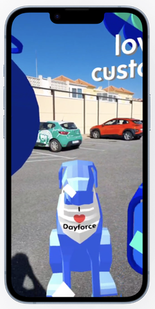
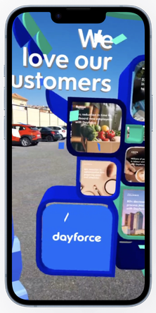
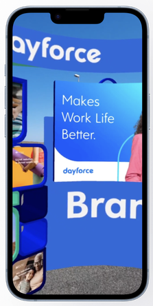
In the world of AR, virtual stands or portal filters are as immersive as it gets. With this type of experience, the viewer gets to explore a 360 degree augmented world, which also opens up a world of possibilities when it comes to what messages you can share with your audience.
Dayforce was excited by this concept, recognizing the potential to surprise and delight their customers while showcasing their reimagined brand.
A portal is something users don’t necessarily expect. It’s not something they’ll see every day. And it gives us a big opportunity to showcase the client’s services in the most immersive and cool way possible. The other solutions are cool too, but they’re not as big, as majestic as a stand or portal.

Once this concept was decided on, Perini and his team dove into exploration. Their first order of business was to clearly define the contents of the stand. Working closely with Dayforce, they decided on key messages and entertaining objects to keep the tone of the experience lighthearted and enjoyable.
That said, even an immersive portal experience has its limitations. When creating this type of AR filter for Instagram, the biggest constraint is size. AR experiences have to stay under four megabytes of space, which means the team needed to be selective about what to include in Dayforce’s stand.
To an extent, this size constraint also determined the style best suited for the experience. Perini explained how a low poly style—a popular approach to 3D graphics known for its performance-efficiency and timelessness—helped keep sizes down and created an attractive, contemporary aesthetic.
Our approach was to use a low poly aesthetic with a more modern tone. Normally, you’ll see each polygon in your model when you use a low poly style, but we tried to play with parameters to get a nice, smooth effect while keeping the low poly look that many people like.

Once Dayforce was happy with every element of the AR stand, the last step was to export the models from Blender, Perini’s 3D tool of choice, to Spark AR, Meta’s AR platform where the team created the final filter for Instagram. Using Spark AR’s portal template as a base, the team made modifications to add flourishes, like animated confetti and functionality, like the ability to enlarge the stand, adding to the immersiveness of the experience.
After successfully bringing each object into Spark AR, we started to create the augmented reality experience, making animations for each object and modifying a default template so users could enlarge the stand and make it as big as a building potentially.

The final effect was a tangible celebration of Dayforce’s transformation, amplifying the conference’s theme of “A Brand New Dayforce” and reinforcing the brand’s promise to make work life better. And that’s a standout experience.
AR Experience Takeaways
Like all design, AR requires balance.
As we’ve touched on, there are a lot of possibilities with this technology, but you’re also working within certain constraints. So, Perini’s advice for those looking to create an AR experience centers on this balancing act. Specifically, he encourages creatives to:
- Find the optimum balance. Try to find the optimum point between a brand's needs, personal taste and the most engaging type of AR filter you can create for your target audience. Like a mathematician, you need to weigh all the conditions to craft a balanced equation.
- Choose your filter carefully. There are many different types of AR filters. So, the key is to focus carefully on what type of filter will be best suited to fulfill your goals while engaging your users. For example, a portal was a great choice to enhance an in-person event but a face filter might be a better choice for a social campaign.
- Keep it simple. It can be tempting to go all out given AR’s expansive nature. But it’s important to keep the user in mind and create experiences that are immersive without being overwhelming. Keeping it simple and focusing on one or two interaction modalities will also help you stay within social AR’s size limits.
- Consider a low poly style. Along the same lines, choosing a low poly style is a great way to keep things simple and aesthetically pleasing. With this style, you get a lot of freedom to explore shapes, characters and new languages of expression. Plus, it’s timeless, it costs less and it weighs less.
- Build on a template. Spark AR and other social tools offer templates for many basic AR experiences, like surface trackers, face filters and portals. Building on an AR template means you don’t have to start from scratch with scripting. Rather, you can save time by customizing a default template to meet your needs.
Like Dayforce’s portal, AR has the power to transport your audience, ignite their imagination and leave a lasting brand impression.
If any of those goals is on your list of priorities, get in touch.
Tessa is a Senior Content Marketing Manager at Superside with a background in conversion copywriting and B2B marketing for SaaS companies. As a publishing graduate and a digital marketing agency veteran with almost a decade of experience, she has a deep appreciation for the art of storytelling and the power of human emotion combined with creativity. When she’s not putting metaphorical pen to paper, she can be found (literally) herding cats, reading books and crushing crosswords. You can connect with her on LinkedIn here.
